


Did you know? Over 60% of global website traffic now comes from mobile devices—if your web design isn’t responsive, you’re losing potential customers before they even see your product. In today’s ultra-competitive digital marketplace, making your website accessible and engaging across all devices isn’t just a bonus—it’s a necessity. In this guide, you’ll uncover practical strategies for harnessing responsive web design to not only attract more visitors but also skyrocket your sales.
Why Responsive Web Design is Essential for Modern Businesses
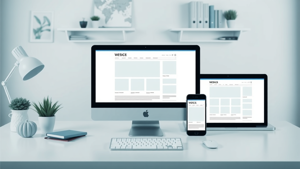
Responsive web design is now the gold standard for modern businesses aiming to thrive online. With customers accessing websites from a growing range of devices—smartphones, tablets, laptops, and desktops—companies can’t afford to ignore the impact of adaptable, fluid website layouts. A responsive site ensures that every visitor receives an experience optimized for their device, directly supporting better user experience and increased sales.
For example, e-commerce stores that employ responsive web design see higher mobile conversion rates and lower bounce rates compared to those with static, desktop-only layouts. Emails, ad campaigns, and social shares are predominantly opened on mobile; if your landing page doesn’t look impeccable at first glance, you risk losing your audience instantly.

- The fundamentals behind responsive web design
- Key elements and tactics for creating an adaptive web page
- How media queries, meta tags, and flexible images play a role
- Actionable strategies for improving sales through responsive websites
"Over 60% of global website traffic now comes from mobile devices—if your web design isn’t responsive, you’re losing potential customers before they even see your product."
Understanding Responsive Web Design: Definitions and Foundations
What Is Responsive Web Design: Key Concepts Explained
Responsive web design revolves around crafting web pages that automatically adjust their layout, images, and content for optimal viewing on any screen size or device. Originally defined by web expert Ethan Marcotte, the approach combines fluid grids, media queries, and flexible images to create web experiences that dynamically reshape based on screen width—without manual intervention. Instead of separate mobile and desktop sites, one set of style sheets and HTML serves all users.
Important concepts include using relative units like percentages in CSS instead of fixed pixel values for layouts, ensuring that images and fonts scale smoothly. Responsive design isn't merely aesthetic; it’s about delivering seamless user experience and accessibility, no matter where or how users access your site. This is especially crucial as people increasingly move between devices throughout the day, expecting fast, beautiful, and easy-to-use web pages everywhere.
The Impact of Responsive Web Design on User Experience and SEO
A well-executed responsive design dramatically enhances both user experience and search engine optimization (SEO). Google explicitly favors mobile-friendly, responsive web pages in its ranking algorithm, rewarding them with higher visibility in search results. When visitors land on your site, responsive layouts eliminate pinch-zooming, sideways scrolling, and awkward navigation, making your brand feel polished and approachable.
Furthermore, responsive web design reduces duplicate content issues—since one version of your site adapts everywhere—streamlining your SEO efforts. Fast load times and intuitive layouts also decrease bounce rates and increase the time users spend exploring your content. Ultimately, when users can easily interact with your site regardless of device, they’re more likely to trust your brand and complete purchases.
Core Components of Responsive Web Design
Responsive Web Layouts: Fluid Grids and CSS Breakpoints
The foundation of a robust responsive web layout is the fluid grid —a flexible structure where all elements scale proportionally based on screen size rather than remaining in fixed positions. By employing CSS relative units like em , rem , and percentages, layouts expand or contract gracefully, filling the browser window intelligently across devices. This approach supersedes rigid, pixel-based layouts, allowing your design to “breathe” with the user’s screen.
Equally important are CSS breakpoints : specific screen width thresholds defined with media queries that trigger alternative layout rules within your CSS style sheets. For example, you might set a breakpoint at 768px for tablets and another at 480px for mobile phones. At each breakpoint, text size, navigation, and images may resize or shift, ensuring every user—whether on a wide desktop monitor or a compact smartphone—enjoys an experience tailored to their device.

Media Queries for Responsive Design: How They Work
Media queries are the magic bullet for tailor-making your web page appearance to any screen size . These snippets of CSS code use logical conditions—like min-width , max-width , or orientation —to detect the characteristics of the device on which the website is being viewed, and then apply styles accordingly. For instance, a media query might enlarge buttons for touchscreens or rearrange navigation on extra-small screens.
Deploying granular media query rules is crucial for a cohesive adaptation across small screens, tablets, and desktops. As users switch between devices, media queries assure content remains readable and interactive, maximizing both accessibility and engagement. For businesses, this means fewer lost sales due to awkward or broken mobile experiences.
The Power of Meta Tag and Viewport Meta in Responsive Websites
HTML’s viewport meta tag is the linchpin for achieving true responsive web design on mobile devices. This snippet appears in the document’s <head> and tells browsers how to adjust the page’s dimensions and scaling based on the device’s screen width. The recommended code— <meta name="viewport" content="width=device-width, initial-scale=1"> —instructs mobile browsers to render the page at the device’s natural width rather than scaling a wide desktop site to fit.
Proper usage of meta tags, especially the viewport meta, prevents problems like text appearing minuscule on mobile, or requiring users to pinch and zoom just to read a headline. It acts as the handshake between your CSS breakpoints and the hardware, ensuring your responsive website looks great wherever it loads.
Optimizing Images with Responsive Image Techniques
Flexible Images and Responsive Images: Best Practices
Flexible images , or responsive images , are critical to web performance and user experience. Traditionally, static images set to a fixed width could break layouts or load slowly on sluggish mobile connections. By contrast, using CSS properties like max-width: 100% ensures images scale down (but not up) to fit their containers. This avoids overflow glitches and delivers an always-pixel-perfect result, regardless of device.
Beyond CSS, responsive image techniques also include the <picture> element and srcset attribute in HTML, enabling browsers to select the most appropriate file size for the user’s screen. This saves bandwidth, speeds up load time on smartphones, and retains crisp visuals for retina displays—all of which make web pages more enjoyable and sales-focused.

Implementing Flexible Images on Your Web Page
To implement flexible images on your web page , start by using the max-width: 100%; rule in your CSS for all images. This simple style ensures that images never exceed the boundary of their containers, keeping layouts tidy as screen sizes shrink or grow. Utilize the srcset and sizes attributes with the <img> tag to deliver various image resolutions depending on the screen width and device pixel ratio.
For more complex requirements, leverage the <picture> element, which lets you serve entirely different images (not just sizes) depending on media queries. This is particularly helpful for switching between detailed graphics for desktop and simpler, more compressed images for mobile phones, improving both speed and design integrity. These small changes add up, creating a faster, more sales-optimized website that delights users on every device.
| Type | Pros | Cons | Best Used In |
|---|---|---|---|
| Fixed Images | Easy to implement Consistent look on a single device | Can overflow or look distorted on small screens Slow loading on mobile devices | Simple static pages; internal dashboards where device diversity is low |
| Responsive Images | Scales to fit every device Faster loading times Better user experience | Requires more advanced HTML/CSS More complex to test | Public websites, e-commerce, blogs, any multi-device context |
Responsive Web Design and Mobile Web Strategy
Crafting Mobile-First Web Design for Responsive Experiences
The mobile-first philosophy means designing your web page’s core layout and features with smartphones and mobile devices as the primary audience. In practice, this means starting your CSS with the smallest screen size, adding complexity only as you scale up to larger viewports. This ensures minimalism, performance, and core usability aren’t sacrificed, making your site instantly accessible to the largest possible audience.
Mobile-first responsive web design goes far beyond shrinking images and columns; it prioritizes readable font size, touch-friendly navigation, and instant-loading assets. By placing the focus on what matters most for mobile users, you naturally create interfaces that scale up elegantly to tablets and desktops, rather than attempting to force desktop complexities to fit into a tiny space.

Why Mobile Web Optimization Is Non-Negotiable
Optimization for the mobile web is not optional—it’s now the expectation of both users and search engines. More internet traffic flows through phones and tablets than any other device, so a sluggish, cluttered or broken mobile site drives users straight to competitors. Google’s mobile-first indexing means a poorly performing mobile experience can tank your entire site’s SEO and visibility.
Well-optimized mobile web design transforms “just browsing” into frictionless shopping, newsletter sign-ups, and real-time customer engagement. Fast-loading, touch-optimized pages with smart anchors, legible font size , and contact buttons within thumb’s reach create a competitive advantage that no business can afford to overlook.

Viewport Meta and Its Influence on Mobile Web Design
The viewport meta tag determines the visible area of a web page on different mobile devices and plays a pivotal role in how a responsive site behaves. By setting the viewport to match the device’s screen width, designers avoid scenarios where pages render as miniature versions of the desktop site, leaving users frustrated with tiny text and images.
Combined with media queries and flexible layout strategies, proper implementation of viewport meta empowers every visitor to effortlessly navigate your site with their thumbs—not their fingers squinting and zooming. This seamless interaction not only improves UX but directly correlates to increased conversion rates and lower abandonment.
Step-by-Step Guide: Building a Responsive Website from Scratch
- Planning your responsive web design strategy: Define your target audience, prioritize core features, and outline key device types. Sketch wireframes or storyboards to visualize interactions at different screen sizes.
- Creating a base layout for desktop: Build a solid HTML structure and use fluid grids to ensure flexibility. Establish color palettes, fonts, and reusable components using modern CSS.
- Creating media queries for tablet and mobile: Write CSS media queries to adjust navigation, columns, and images for intermediate and small screen sizes . Focus on usability—touch targets, readable font sizes, and clear calls-to-action.
-
Adding responsive and flexible images: Use
max-width: 100%;andsrcset/<picture>to optimize image loading and scaling. - Fine-tuning with viewport meta and meta tags: Ensure your web page includes essential meta tags for device scaling and search engine clarity.
- Testing across devices and browsers: Use built-in browser tools, cloud simulators, and real devices to fix any display, speed, or usability issues.
Key Tools and Frameworks for Efficient Responsive Web Design
Building fully responsive web pages is easier and faster with modern tools and frameworks. Industry-standard CSS frameworks like Bootstrap and Foundation come with built-in grid systems, pre-styled components, and default media queries tailored for cross-device compatibility. Visual design tools such as Figma or Adobe XD allow teams to prototype and test responsive design concepts quickly before coding.
For debugging and testing, browser developer tools (in Chrome, Firefox, and Edge) simulate a variety of devices, while online platforms like BrowserStack or Sauce Labs let you check your layouts on real hardware. These tools streamline the process, ensuring your responsive website always delivers a polished result.

Best Practices for Enhancing Sales with Responsive Web Design
How Responsive Design Increases Conversion Rates
A seamless responsive design directly impacts your bottom line. When users can browse effortlessly on any device, they're less likely to abandon their carts or exit mid-purchase. Responsive web design adapts CTAs, order forms, and payment options for both desktop and mobile, reducing errors and streamlining the sales funnel.
Consistency in design elements across screen sizes builds trust and familiarity, which subconsciously encourages users to convert. When all the friction points—from awkward navigation to slow images—are eliminated, conversion rates can leap. In competitive analysis, businesses with responsive websites consistently outperform their rigid counterparts.

Optimizing Web Page Speed for Improved Sales
Fast web page loading is essential for keeping potential customers engaged. Compress images, streamline code, and use lazy loading to ensure assets don’t bog down your site on slow mobile networks. Responsive web design isn’t just about appearance; it’s about creating performance-centric web experiences that hold users’ attention and move them quickly to purchase decisions.
Integrating strategies like content delivery networks (CDNs), minified style sheets, and asynchronous JavaScript delivery can further reduce load times. Research shows that even a one-second delay in page load can drop conversion rates by 7%—an investment in speed is an investment in sales.
Keeping Navigation User-Friendly Across Devices
Responsive navigation adapts menu structures and links for thumb-friendly accessibility on mobile devices, while preserving intuitive site structure for larger screens. Using off-canvas menus, toggle icons, and hierarchical links, you can deliver seamless wayfinding no matter the screen size or orientation.
Ensure navigation bars and buttons are large enough to tap without zooming, and place critical links where users expect them. Test on multiple devices; what works with a mouse might not translate to a touchscreen. When navigation is easy, visitors stay longer—and so do their orders.
A/B Testing Responsive Web Elements for Maximum Impact
Effective A/B testing is a secret weapon for maximizing sales through responsive web design. By creating alternative versions of layouts, CTAs, or buy buttons tailored for specific devices, designers discover which iterations drive higher clicks, sign-ups, or purchases. Responsive A/B tests can also target navigation changes or image styles across screen widths, fine-tuning every user touchpoint.
Use analytics and heatmaps to monitor interactions. Iterative improvements, based on real user behavior, lead to measurable increases in conversion rate and revenue.
"A seamless mobile web experience can boost your e-commerce conversion rates by up to 30%."
Common Mistakes to Avoid in Responsive Web Design
- Ignoring mobile optimization
- Overusing large images without compression
- Failing to set proper viewport meta tags
- Neglecting touch-friendly navigation in web design
Avoid these pitfalls by prioritizing mobile web optimization from the outset, compressing assets, adding essential meta tags, and designing layouts that feel natural on any device.
Case Study Examples: Success Stories with Responsive Web Design

How a Responsive Website Revamped a Retailer’s Online Sales
A leading retail brand overhauled its outdated, desktop-only website with a fully responsive redesign. By adopting flexible grids , optimized responsive images , and dynamic navigation menus, the retailer saw mobile conversion rates more than double within two months. Customers praised the clean, easy-to-browse interfaces and improved checkout experience.
This transformation didn’t just bring more visitors; it translated into real-world revenue, with lower bounce rates and higher average order values across every device segment.
Measurable Business Growth through Web Design Transformation
Beyond individual stories, the data is undeniable: businesses that lean into responsive web design report across-the-board gains. From international retailers to local service providers, the results include drops in cart abandonment, improved SEO rankings, and enhanced customer satisfaction. Investing up-front in a flexible, mobile-friendly design produces returns that compound with every device upgrade and platform shift.
These successes come from constant iteration—testing, listening to customer feedback, and staying ahead of digital trends. Responsive design isn’t a one-and-done effort; it’s a smart growth strategy.
| Bounce Rate | Conversion Rate | Avg. Revenue per User | |
|---|---|---|---|
| Before Responsive Design | 55% | 1.9% | $40 |
| After Responsive Design | 32% | 4.7% | $67 |
People Also Ask
What is responsive web design?
- Responsive web design refers to constructing websites that automatically adapt their layout and elements to fit any screen or device, enhancing the user's browsing experience irrespective of their device.
What are the three basic things required for responsive web design?
- The three essential things needed for responsive web design are: fluid grid layouts, flexible images, and media queries. These enable websites to adjust dynamically across different devices.
What is response in web design?
- Response in web design means the web page’s adaptability to different devices and viewports, ensuring content displays optimally no matter the screen size.
What is an example of responsive design?
- An example of responsive design is a retail website whose content reorganizes seamlessly—the product grid, navigation, and images all rearrange and resize—when accessed from a mobile phone versus a desktop browser.
Frequently Asked Questions on Responsive Web Design
- Does responsive web design impact SEO?
- How much does it cost to build a responsive website?
- How can I test if my site is using responsive web design?
- Are media queries still essential in 2024?
- What tools help with responsive debugging?
Expert Insights on Future Trends in Responsive Web Design

As technology evolves and new devices emerge—from wristwatches to virtual reality headsets— responsive web design will remain the bedrock of digital interaction. Experts predict that websites will not only adapt to varied screen sizes, but also to entirely new modes of engagement, prioritizing speed, accessibility, and immersive experiences. Embracing device-agnostic, flexible frameworks is the surest pathway to futureproofing your business on the web.
"The future of web design is fully immersive and device-agnostic—responsive web design will remain the pillar of digital interaction as IoT devices and wearables rise."
Summary of Actionable Takeaways for Responsive Web Design Success
- Always use a mobile-first strategy
- Employ media queries and flexible images throughout
- Never ignore meta tags, especially viewport meta
- Continuously test your responsive website on real devices
Ready to Revolutionize Your Business with Responsive Web Design?
- Get expert help to upgrade your web design and boost your digital sales with our professional responsive web design services!
Video Guides to Responsive Web Design
- Walkthrough: Creating a responsive web page layout
- Responsive images in practice: Demonstration and tips
- Debugging common responsive design issues
- Step-by-step: Implementing viewport meta and media queries
- Interview: Leading web design experts discuss future trends
Take action now : Invest in responsive web design and unlock the potential for digital sales success, no matter where your customers are browsing!
To deepen your understanding of responsive web design and its impact on digital success, consider exploring the following resources:
-
“Responsive Web Design” : This Wikipedia article provides a comprehensive overview of responsive web design, detailing its principles, history, and significance in creating adaptable web pages across various devices. ( en.wikipedia.org )
-
“What Is Responsive Web Design? (And How It Works)” : Published by WebFX, this article explains the fundamentals of responsive web design, including how it functions through CSS and the benefits it offers to businesses aiming for a consistent user experience across all platforms. ( webfx.com )
These resources offer valuable insights into implementing responsive web design strategies to enhance user engagement and boost sales.


Write A Comment