


Did you know over 70% of all web traffic is now coming from mobile devices? In today’s digital world, responsive landing pages aren’t just a luxury—they’re essential for businesses determined to maximize conversion rates. If you want to transform casual visitors into loyal customers, you need landing pages that adapt seamlessly—no matter the device. In this guide, you’ll discover proven strategies and expert insights to ensure your landing pages don’t just look good; they skyrocket your conversions.
Harnessing the Power of Responsive Landing Pages for Maximum Conversion Rates
Did you know that over 70% of web traffic now comes from mobile devices? Responsive landing pages can capture this audience and dramatically increase conversion rates.
Discover the techniques and strategies used by top marketers to create landing pages that drive results across every device.

Key Lessons to Optimize Responsive Landing Pages for Conversion
The fundamentals of responsive landing page design
Types of landing pages and their uses
How to choose and customize a responsive landing page template
Critical elements that influence conversion on responsive landing pages
Best practices for maximizing results across desktop and mobile
What is a Responsive Landing Page?
Responsive Landing Pages Explained
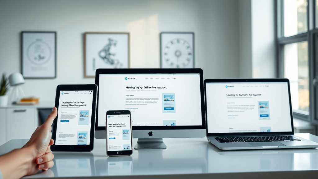
At its core, a responsive landing page is a web page designed to automatically adjust its layout, images, and functionality so it looks and works perfectly no matter the device—be it a desktop, tablet, or mobile device. This design approach leverages flexible grids, CSS media queries, and adaptive images to deliver a consistent user experience. When you build with responsive landing pages, you ensure every visitor has the same high-performing, visually appealing experience, regardless of how they arrive at your site.
For marketers and business owners, this means that your conversion opportunities aren’t bottlenecked by device compatibility issues. Whether prospects are browsing on a large office monitor or a small smartphone screen, your landing pages are always clear, accessible, and ready to convert. Ultimately, responsive design reduces bounce rate and maximizes your ability to engage with audiences wherever they are.
How Responsive Landing Pages Differ From Traditional Landing Pages
Traditional landing pages are often designed primarily for desktop users, with a fixed-width layout that may look broken or difficult to navigate on smaller screens. In contrast, responsive landing pages dynamically rearrange elements, resize text, and adapt functionality to fit every screen. This adaptability ensures higher conversion rates because users are less likely to abandon a page due to poor usability.
Moreover, responsive landing pages incorporate best practices in landing page design , such as touch-friendly buttons, optimized images, and streamlined navigation. This means fewer obstacles between your visitor and your call-to-action, delivering the fast, easy, and visually compelling experience modern consumers expect whether they’re at home or on the go.
Mastering Landing Page Templates for Responsive Landing Pages
Choosing the Right Page Template for Your Campaign
Success starts with selecting a landing page template tailored to your campaign goals. With countless page templates available, prioritize those specifically optimized for responsive landing page design. The right template will already include elements like flexible columns, adjustable images, and clear calls-to-action that look fantastic on all devices.
When evaluating templates, focus on ones that are easy to customize, offer pre-built sections for testimonials, product features, or lead generation forms, and have built-in mobile responsiveness. Consider your conversion goal : are you seeking direct sales, capturing leads, or encouraging downloads? Make sure the template you choose matches this objective and supports your desired user experience.
Responsive Landing Page Templates: Features and Benefits
Modern responsive landing page templates deliver far more than cross-device compatibility. They’re designed for speed, integrate seamlessly with analytics tools, and often provide optimized content layouts following current UI/UX trends. These templates feature editable headline blocks, smart content stacking for mobile devices, and fast-loading elements to keep bounce rates low.
The benefits are clear: starting with a professionally designed template shortens your path to launch, incorporates conversion-focused best practices, and increases the likelihood of success for every campaign. Whether you use a drag-and-drop builder or code customizations yourself, responsive templates are the backbone of high-converting landing pages.
Top 5 Responsive Landing Page Templates for 2024
With dozens of options available, here are five of the most recommended responsive landing page templates for this year:
Unbounce Classic: Renowned for robust A/B testing tools and true mobile responsiveness.
Leadpages Conversion: Designed to minimize distractions, maximize action, and ensure device readiness.
Elementor Pro Template: Best for WordPress users; highly customizable and visually stunning.
Instapage Studio: Offers integrations, analytics, and drag-and-drop functionality for fast deployment.
HubSpot Landing Pages: Seamless integration with CRM for ultimate personalized lead generation.
Comparing Popular Responsive Landing Page Templates: Pricing, Features, and User Ratings |
|||
Template |
Pricing |
Key Features |
User Ratings |
|---|---|---|---|
Unbounce Classic |
$90/mo |
A/B Testing, fast loading, highly customizable |
4.7/5 |
Leadpages Conversion |
$49/mo |
Mobile-first, drag-and-drop, templates library |
4.5/5 |
Elementor Pro |
$59/yr |
WordPress integration, visual editor, third-party add-ons |
4.6/5 |
Instapage Studio |
$199/mo |
Real-time collaboration, analytics, heatmaps |
4.8/5 |
HubSpot Landing Pages |
$50/mo |
CRM integration, smart content, built-in forms |
4.7/5 |
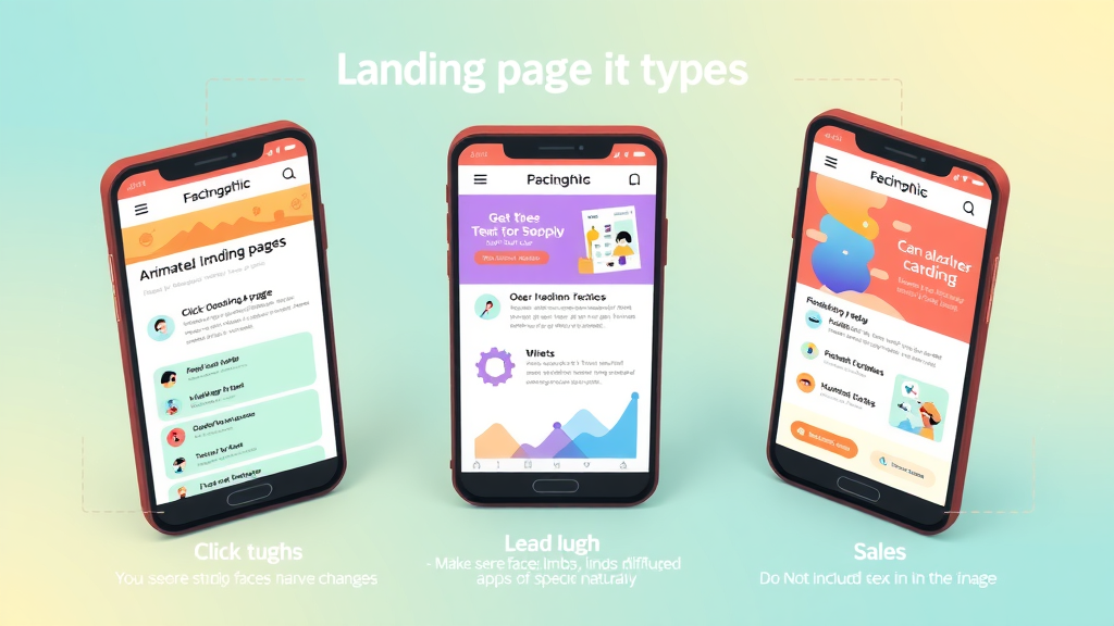
The Three Types of Landing Pages and Their Role in Responsive Landing Pages
Exploring Click-Through, Lead Generation, and Sales Landing Pages
Landing pages come in three primary forms, each with a unique role:
Click-Through landing pages: Used to warm up users for conversion, these bridge the gap between a marketing message and the final conversion step.
Lead Generation landing pages: Also known as lead gen pages, these are designed to capture visitor information through forms. Responsive designs on these pages reduce friction and increase completion rates on mobile devices.
Sales Landing Pages: The most direct, these pages focus on driving immediate sales. Effortless navigation and persuasive content tailored to every screen size are crucial to increase conversion rates here.
Each page type benefits immensely from being responsive ; mobile-friendliness is a core differentiator in delivering great user experience and generating better conversion rates.
Advantages of Responsive Landing Pages in Lead Generation
Responsive landing pages are invaluable for lead generation efforts. When users come from paid ads or social media on mobile devices, a responsive landing page ensures that forms are easy to fill, messages are clear, and navigation is intuitive. This eliminates the excuses and obstacles that often cause visitors to abandon pages on smaller screens.
By streamlining form fields, providing auto-fill functionality, and making CTAs tap-friendly, businesses see a marked improvement in lead submissions and lower bounce rates. Responsive landing pages keep prospect engagement high—so you can capture more qualified leads and move them through your sales funnel faster.
Essential Elements of High-Converting Responsive Landing Pages
Critical Components: Headlines, CTAs, and Visuals in Responsive Landing Pages
High-converting responsive landing pages have several components working together. The headline grabs immediate attention; it should be concise, benefit-driven, and readable across all devices. Strong CTAs (calls-to-action) use actionable language and stand out visually so users naturally move toward your goal, whether submitting a form or clicking a download button.
Visual elements—such as product images, testimonial graphics, or explainer videos—need to reflow elegantly between devices to maintain impact. All visuals should be optimized for quick loading to minimize bounce rate. Effective landing page design ensures that content hierarchy is preserved and that users always know what step to take next, no matter their screen size.
Optimizing Page Design for Maximum Conversion
Landing page design must remove friction points that deter conversions. This means using whitespace strategically, breaking up text with bullet points, and keeping navigation minimal. For mobile users, CTA buttons should be large, clickable, and within easy reach of the thumb.
Incorporate trust elements such as security badges, customer testimonials, and guarantees to give users confidence in taking action. Responsive landing pages that balance informative content, persuasive elements, and an easy user journey consistently outperform those that don’t prioritize experience across devices.
Optimized Layout Strategies for Responsive Landing Pages
Layout strategies that work well for responsive landing pages include stacking content vertically, using collapsible sections, and prioritizing above-the-fold content. By keeping the most important information and your main CTA front and center, users are guided to convert with minimal scrolling. Images and forms should automatically resize, and animations or interactive elements should be lightweight and touch-friendly for all mobile devices.
"Design is not just what it looks like and feels like. Design is how it works." – Steve Jobs

Responsive Landing Page Design Best Practices
5 Must-Follow Tips for Effective Landing Page Design
Start with a mobile-first mindset: Design your landing page for mobile devices first, then scale up for desktop. This ensures key content is never missed.
Keep forms short and sweet: Optimize your lead generation forms for quick completion on touch devices. Ask only for the essentials.
Highlight your CTA: Use color contrast, size, and whitespace to make your CTA impossible to miss on any device.
Choose fast-loading templates: Every second of delay reduces conversion rates. Pick a page template proven for speed.
Test and optimize: Use tools to gather user data and A/B test new variant ideas to keep improving over time.
Trends in 2024: Adapting Responsive Landing Pages for Modern Users
Using mobile-first design principles that prioritize thumb-friendly navigation, streamlined layouts, and frictionless forms.
Leveraging interactive page elements such as sliders, polls, or simple animations to enhance engagement.
Fast-loading page templates and compressed media assets for performance-optimized user experience.

Direct Response Landing Pages: How to Capture Immediate Action
Characteristics of a Direct Response Landing Page
A direct response landing page is laser-focused on driving a single, immediate action—such as making a purchase, signing up for a newsletter, or downloading content. These pages eliminate distractions: no site navigation, minimal links, and a clear, hard-hitting CTA. Their success depends on perfectly aligning the offer, copy, and design for fast decisions, especially on mobile devices.
Responsive direct response pages must load quickly, use bold headlines, and present social proof near the CTA. Testimonials, benefit-driven copy, and tight alignment between marketing message and landing page design set the stage for higher conversions across all screen sizes.
Turning a Responsive Landing Page Into a Direct Response Powerhouse
To maximize conversions for a direct response landing page , make sure it is fully responsive and optimizes every interaction. This means ensuring CTAs are easy to tap, important information is never hidden or forced below the fold, and loading times are kept to a bare minimum.
Remove all unnecessary elements—focus relentlessly on the message, CTA, and user trust signals. By integrating A/B testing and data-driven optimizations, you transform a standard landing page into a direct response machine that delivers results across mobile, tablet, and desktop.
Mobile-Friendliness: Making Your Responsive Landing Pages Convert on Every Device
Why Mobile Optimization Drives Higher Landing Page Conversion
With the majority of traffic now on mobile devices, mobile optimization isn’t a nice-to-have—it’s a necessity. Optimizing your responsive landing pages for smartphones and tablets ensures visitors can access your offer, interact with forms, and click CTAs without frustration. The payoff? Reduced bounce rate, increased time on page, and ultimately, more conversions.
Mobile-first landing page design prioritizes tap interactions, faster loading (especially on slower mobile connections), and clear navigation. Every second counts: research shows mobile users expect instant page loads, and even minor delays can kill your conversion rate.
Adapting Layout and Content for Mobile Users in Responsive Landing Pages
Responsive landing pages adapt their layout automatically to accommodate smaller screens—stacking columns, enlarging tap targets, and increasing font sizes for readability. Keep mobile forms as short as possible, pre-fill data where you can, and use sticky CTAs that remain visible as the user scrolls.
Prioritize your most important content, use collapsible sections or accordions for longer explanations, and avoid pop-ups or slide-ins that can interrupt the user experience on mobile devices. The goal is to provide a professional landing page experience that boosts conversions no matter how visitors find you.
Mobile Testing Checklist for Responsive Landing Pages
Test visuals, CTAs, and forms in both portrait and landscape orientations
Verify page speed and check for large image or script bottlenecks
Interact with all elements—ensure nothing gets cut off or hidden
Submit forms on multiple devices and operating systems
Check that your layout remains intuitive, and tap zones are accessible

Boosting Results with a Landing Page Builder
Benefits of Using a Landing Page Builder for Responsive Landing Pages
A landing page builder takes the complexity out of launching responsive landing pages. These tools provide intuitive drag-and-drop editors, pre-built responsive templates, and built-in analytics, making it easy to design, deploy, and optimize pages without a developer. With a professional landing page builder, you can focus on conversions instead of coding headaches, getting your campaigns to market faster.
Most landing page builders offer real-time collaboration, plus built-in integrations with analytics, CRM systems, and A/B testing tools. By leveraging these platforms, marketers and teams can continuously test messaging, imagery, and layouts to find what delivers the best conversion rates.
Top 3 Landing Page Builders for Effortless Responsive Design
Drag-and-drop functionality: Build complex layouts in minutes—no coding required.
Built-in responsive landing page templates: Instantly match your campaign needs while ensuring mobile-friendliness.
Seamless A/B testing tools: Launch multiple variations, analyze results, and adapt quickly for higher conversions.

Real-World Case Studies: Responsive Landing Pages and Conversion Growth
Industry Leaders Using Responsive Landing Pages
Top brands from SaaS startups to global e-commerce giants trust responsive landing pages to convert visitors. For example, Dropbox and Shopify attribute higher sign-up rates to paged streamlined for every device. Every member of their digital team, from marketers to designers, works together to A/B test copy, images, and layouts that fit the responsive formula.
Even smaller businesses find success: Local services, medical offices, and professional consultants rely on templates and page builders that push the boundaries of conventional landing page design, leading to more bookings, higher interaction, and more loyal customers regardless of how visitors arrive.
Case Study: Lead Generation Success with Responsive Landing Page Templates
One B2B marketing agency transitioned all their lead gen campaigns to use responsive landing page templates. They experienced a 36% increase in leads and a 22% drop in bounce rate within three months—simply by upgrading their web page templates to a mobile-first, responsive format. Their forms became easier to use, their headlines more readable, and their CTAs more compelling, especially on mobile devices.

People Also Ask: Understanding Responsive Landing Pages
What is a responsive landing page?
Answer:
A responsive landing page seamlessly adapts its layout and design to display optimally across all devices—desktop, tablet, and mobile—offering users a consistent and engaging experience that maximizes opportunity for conversion.
What are the three types of landing pages?
Answer:
The three primary types of landing pages are click-through landing pages, lead generation landing pages, and sales landing pages. Each serves a distinct role in moving users along the conversion funnel, and responsive design enhances usability and conversion for all three.
What is a direct response landing page?
Answer:
A direct response landing page is crafted to prompt an immediate action from the visitor, such as making a purchase, subscribing, or requesting a quote. Responsive landing pages allow this experience to remain seamless regardless of device.
How to make your landing page mobile friendly?
Answer:
To make your landing page mobile friendly, use a responsive landing page template, optimize images and call-to-action buttons, ensure fast page loading times, and test on multiple device types for usability.
Frequently Asked Questions About Responsive Landing Pages
Why do responsive landing pages matter for conversion? Responsive landing pages ensure that your message, offer, and action steps are visible and accessible on any device, reducing bounce rate and maximizing every conversion opportunity.
Are there free responsive landing page templates available? Yes, many site builders and platforms like Elementor, Wix, and Mailchimp offer free responsive templates to get you started quickly.
What are some common mistakes on responsive landing pages? Overcrowded layouts, non-optimized images, hidden CTAs, and slow-loading scripts are common pitfalls that can tank your conversion rates.
How often should you update your responsive landing page design? Regular A/B testing and at least quarterly updates keep your landing page design fresh, relevant, and optimized for the best results.
What landing page metrics should you monitor? Track bounce rate, average time on page, conversion rate, and form completion rates to gain actionable insights and maximize your responsive landing page’s impact.
Strategies to Continuously Optimize Responsive Landing Pages
A/B Testing for Responsive Landing Pages
A/B testing lets you compare different versions of your responsive landing pages to see which layout, copy, or image drives the best results. Top landing page builders make it simple to launch landing page tests, monitor results, and iterate quickly. Test one element at a time—CTAs, headlines, images—for data-driven decisions that lead to fast conversion growth.
Set clear goals for each test and let the results run long enough to be statistically significant. Whether you’re adjusting for mobile devices or desktop, continuous A/B testing ensures your responsive landing page design never goes stale.
Analyzing Conversion Data to Refine Responsive Landing Pages
Use analytics tools—like Google Analytics or your platform’s built-in dashboard—to monitor how users interact with your landing pages. Pay attention to bounce rate, drop-off points in forms, and device-specific behaviors. These insights guide ongoing improvements in layout, messaging, and user experience.
Review heatmaps to see what users engage with, and make incremental design updates that remove obstacles and clarify your CTA. The most effective responsive landing pages are always evolving, guided by real-world performance data.
Staying Ahead: Responsive Landing Page Trends and Innovations
Keep an eye on UI/UX trends such as voice search optimization, AI-personalized content, and conversational forms for landing pages. Experiment with interactive elements like quizzes or calculators—these boost engagement on responsive pages. Regular training for your marketing team and investing in the latest page builders ensures your landing pages are always one step ahead of the competition.
Key Insights for Deploying Responsive Landing Pages That Convert
Start with a mobile-first, responsive landing page design
Use proven landing page templates for rapid deployment
Continually test and improve to maximize conversion
Focus on clear calls-to-action and streamlined user experience
Accelerate Your Conversions with Professional Responsive Landing Pages
"The right responsive landing page can be the difference between a visitor and a loyal customer. Don’t leave your conversions to chance—optimize, adapt, and watch your results soar."
Ready to boost your results? Invest in professionally designed, responsive landing pages today—leverage proven templates and innovative design strategies to maximize every conversion opportunity.
To enhance your understanding of responsive landing pages and their impact on conversions, consider exploring the following resources:
“The Importance of Responsive Design in Landing Pages” : This article delves into how responsive design ensures a consistent and user-friendly experience across various devices, emphasizing its role in enhancing user engagement and boosting conversions. ( texaswebdesign.com )
“Make Your Landing Pages Mobile Responsive” : This resource provides insights into creating landing pages that adapt seamlessly to both desktop and mobile devices, highlighting the benefits of using responsive templates and tools to improve user experience and conversion rates. ( unbounce.com )
By exploring these resources, you’ll gain valuable insights into the significance of responsive design in landing pages and practical strategies to implement it effectively.


Write A Comment